
The question stays visible
A reader should understand why the dashboard exists before interpreting individual charts.
A considered collection of public visualisations that show how data can explain a problem, reveal a signal and make the next decision clearer.
Every visualisation remains the work of its credited creator and links to the original on Tableau Public.
Original DataDive work and public visualisations selected from Tableau Public.
Named beside every visualisation, with a direct Tableau Public link.
Create original work and explain why each selected design is useful.
They help a particular audience understand something faster. We look for visualisations that organise complexity, reward exploration and keep the underlying question visible—even when the subject is unfamiliar.
Designed and built by our team
Created in Tableau by DataDive
Featured in Tableau’s official Viz Gallery
A reader should understand why the dashboard exists before interpreting individual charts.
Colour, position and scale should direct attention—not make every data point compete equally.
Filtering and exploration should help someone investigate, compare or decide what happens next.
Future selections will broaden the collection across the kinds of decisions organisations make every day. The goal is not to collect every attractive dashboard; it is to show distinct, reusable ways of thinking with data.
We do not copy a public dashboard and replace the logo. DataDive adapts the useful principles—hierarchy, interaction, narrative and analytical structure—to your metrics, users, data quality and operating decisions.
Explore Tableau dashboard developmentBring us the reporting problem, the audience and the decision that feels harder than it should. We will help shape the analytics around it.
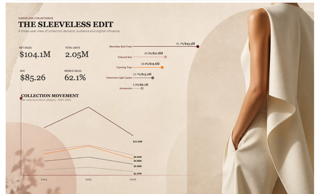
DataDive creates, curates and comments on the work shown here. The Sleeveless Edit is an original DataDive concept; selected visualisations remain the intellectual work of their named creators. All examples link to Tableau Public. Tableau is a trademark of Salesforce, Inc.